Analyst/Heatmap Help and Definitions

A Work in Progress


Input File Format

The input file format is based on the output of the Analyst™ Platereader, but the actual format requirements are fairly straightforward and flexible. The file can be a Microsoft Excel™ spreadsheet (.xls) file of a tab-delimitted ASCII text file. The heatmap program will automatically detect which of these file types was used. Note to Open Office users: As of the time this was written, the portion of the program that reads Excel files could not read .xls files created by Open Office Calc, only those created by Microsoft Excel itself. The author of this code, an Open Office user, shares your frustration and is looking for a solution.

The file format is a series of plates, each represented by a set of metadata, followed by a matrix of well values, followed by one or more blank rows/lines. The metadata is a series of name-value pairs in columns one and two. The only metadata that is required (or used) is the "Barcode" field, whose name can be any of "Barcode:", "Barcode", "Plate ID:" or "Plate ID". ("Barcode:" has precedence. In the example below, both "Barcode:" and "Plate ID:" are given. The value for "Barcode:" - *001+59* - will be used.) The value associated with the Barcode field is used as a unique name for the plate for display (and for data submission in the internal version.)

The well matrix is a series of rows corresponding to the rows of the plate. The first column contains the row letter and later columns contain well values. The matrix must be preceded by a row with an empty first field and column numbers for the plate in later columns.

Example:
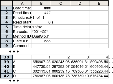
File Format Example (Excel version)

Sample Data

There are two sample files available for experimenting with the Heatmap page:
Sample 1 - sample1.csv
This file is a compilation of the plates used as examples in Ramadan N., Flockhart I, Booker M, Perrimon N, Mathey-Prevot B Design and implementation of high throughput RNAi screens in cultured Drosophila cells, publication pending. Each plate is accompanied by a brief comment about what it is meant to demonstrate. Some of the plates are raw data from public screens completed at the DRSC. Some of it was generated artificially to create a clean example of a single case. Comments in the file identify which is which.

Sample 2 - sample2.xls
This is a file taken from the Analyst™ Platereader during the course of the screen DasGupta R Kaykas A, Moon RT, Perrimon N. Functional genomic analysis of the Wnt-Wingless Signaling Pathway. Science. 2005 Apr 7. The file has been converted from text to Excel Spreadsheet format by the screener, but this does not affect how the Heatmap page handles it.

Computation Format

This radio button group selects the computation to be performed on the data before the results are displayed. Regardless of what format is chosen, the raw data from the input file is what will be stored in the database. The computation affects what data is displayed and what data goes into the tab-delimitted output file that is created. Cutoff calculations are performed against the computed values.
Z score
This is a measure of distance, in standard deviations, from the plate mean. A well with a Z score of 0 has the same raw value as the plate mean. A well with a Z score of 1.0 is exactly one standard deviation above the plate mean and a Z score of -0.5 is half a standard deviation below the plate mean.

(Well - Median)/Interquartile Range
This is a measure distance from a middle value similar to Z score, but it is based off of interquartile range instead of standard deviation. Interquartile Range is used because it can be less sensitive to the effects of extreme outliers than standard deviation. Note that the median is used for a middle value instead of the mean.

There are several, subtly different ways to compute Interquartile Range. The specific method used is defined here.

Log(Value/Average)
With this computation we try to measure degree of variation from average on a compressed (logarithmic) scale.

Log(Raw Value)
This is just the log (base 10) of the raw value. This can reduce the effect of extreme outliers.

Raw Data
If this option is selected, no computation is performed and the input data is displayed unchanged. (Note that the input data may already be the combination of multiple raw values from the database (see below.)

Highlighting

This collection of radio buttons determines how outliers (defined in other sections) are indicated on the heatmapped plate tables.
None
If none is selected, no highlighting is performed. Outliers are displayed in the same manner as non-outliers. Note that outliers are still computed and will still be used in the data file if Save to file as is set to "Outliers Only List" or if outliers are submitted as hits.
1.01 0.85 -2.39
0.33 -0.90 -0.24
1.90 2.02 1.53
Basic
This is the default highlighting scheme. Outliers are displayed in boldface and are colored in red if they are low outliers or blue if they are high.
1.01 0.85 -2.39
0.33 -0.90 -0.24
1.90 2.02 1.53
Strong
With strong highlighting, the text is colored in the same manner as in the basic scheme, but in addition the background color scheme is changed to a heavily faded version for non-outliers to further call attention to the outliers.
1.01 0.85 -2.39
0.33 -0.90 -0.24
1.90 2.02 1.53
Mask Others
In this scheme, outliers are displayed with normal text, but all other (non-outlier) wells are blackened so that only the outliers are immediately visible. Note that the non-outlier wells are actually computed and displayed, they are simply displayed as black text on a black background. The values can still be seen by selecting the text in those wells with the mouse.
1.01 0.85 -2.39
0.33 -0.90 -0.24
1.90 2.02 1.53

Combine raw data from this column ...

If this checkbox is checked, the data column (not plate column) indicated above will be combined, well by well, with the data from a second data column for the same plate. If data is not available for the second plate, it will not be shown. This does not create a new, third column of data in the database, but the results can be retrieved as a tab-delimitted file, which DRSC staff can then add to the database as a third column if asked to do so.

The method of combination can best be described by designating the original field/data column, which is selected from the "type of data being collected" pulldown menu or named in the next field if this is a new data type, as field F1 and the field/data column indicated in the pulldown menu in the combine data area as F2.

Reduced by
F1 - F2
Subtracted from
F2 - F1
Added to
F1 + F2
Multiplied by
F1 * F2
Divided by
F1 / F2
Divides
F2 / F1
Averaged with
(F1 + F2) / 2
Max of pair with
Maximum of F1 & F2
Min of pair with
Minimum of F1 & F2

Statistical Normality

Statistical normality vs. normalization: It is important to distinguish between the terms "Statistical Normality", described here, and "normalization". Determining statistical normality means examining the distribution of a single dataset to see if the results show bias or are skewed in some way. Testing for statistical normality is an essential step in the analysis of HTS datasets. Most statistical tests that are applied to large datasets, including most of those used in the Computation Format section of this page, work under the assumption that the dataset to be tested is at least close to statistically normal. Most datasets contain some bias, which can be compensated for through the use of normalization techniques. "Normalization" refers to the manipulation of data from multiple sets to make data from different plates comparable. The calculations available in the Computation Format section can be classed as normalization techniques.

Statistical Tests: We provide tests of the normality of plate values by running the Jarque-Bera and Shapiro-Wilk statistical tests (against all wells, non-edge wells and non-control wells), and providing summary values for the whole dataset. These tests are not performed by default because they increase page display time considerably.

The Jarque-Bera score indicates deviation from normality with a perfect score being 0. The Shapiro-Wilk score indicates degree of normality with a perfect score being 1. In both cases a probability of normality score (P-value) is also provided. The P-values are generally easier to interpret, with values greater than 5.0x10⁻² being considered good for our 384-well RNAi experiments. P-Values below 1.0x10⁻⁵ should be cause for reevaluating the plate or possibly the experiment. The normality of the data can also be evaluated visually by selecting the "Q-Q Plot" button for a Quantile-Quantile plot of the data against a normal curve. Perfectly normal data should form a straight diagonal line across the graph. The Q-Q Plot page will include the results of the S-W and J-B tests for all wells and all non-edge wells regardless of whether statistical tests were selected for the main page.